Refreshing a Decade-old Pub back to it’s glory
The Goat is a central pub in downtown Haifa, sitting right on the main road next to a metro stop. It’s the kind of place most people in the area have already walked past (or into) at least once.
The appeal is deliberately simple: fair prices, fast service, a solid beer selection, and food that makes it easy to stay for another round. The crowd is mixed by design - students, young locals on a budget, and anyone looking for a classic pub night without paying “craft bar” prices.
The problem wasn’t demand. It was perception. The brand hadn’t meaningfully changed since opening almost a decade ago, and it no longer matched the atmosphere the owners wanted the place to be known for.
The Brief, in Brief
The Goat doesn’t run on a forced theme. The people inside create the vibe, and the staff’s job is to support it - not direct it. So the identity needed to feel confident and recognizable without looking like it’s trying too hard to be “a concept bar.”
At the same time, the brand needed to hint at longevity: not a shiny new venue, but a place on its way to becoming one of those Haifa staples people recommend without thinking.
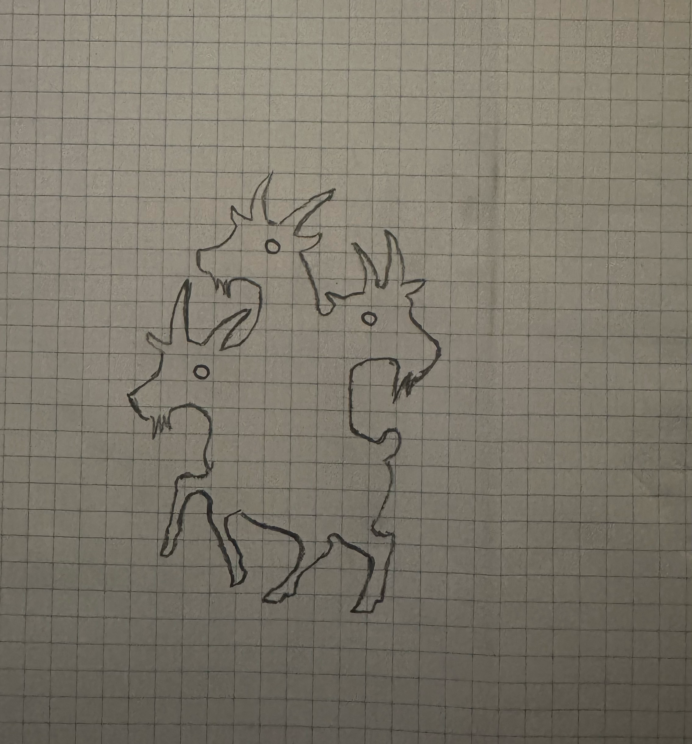
*actual first doodle

What We Anchored On
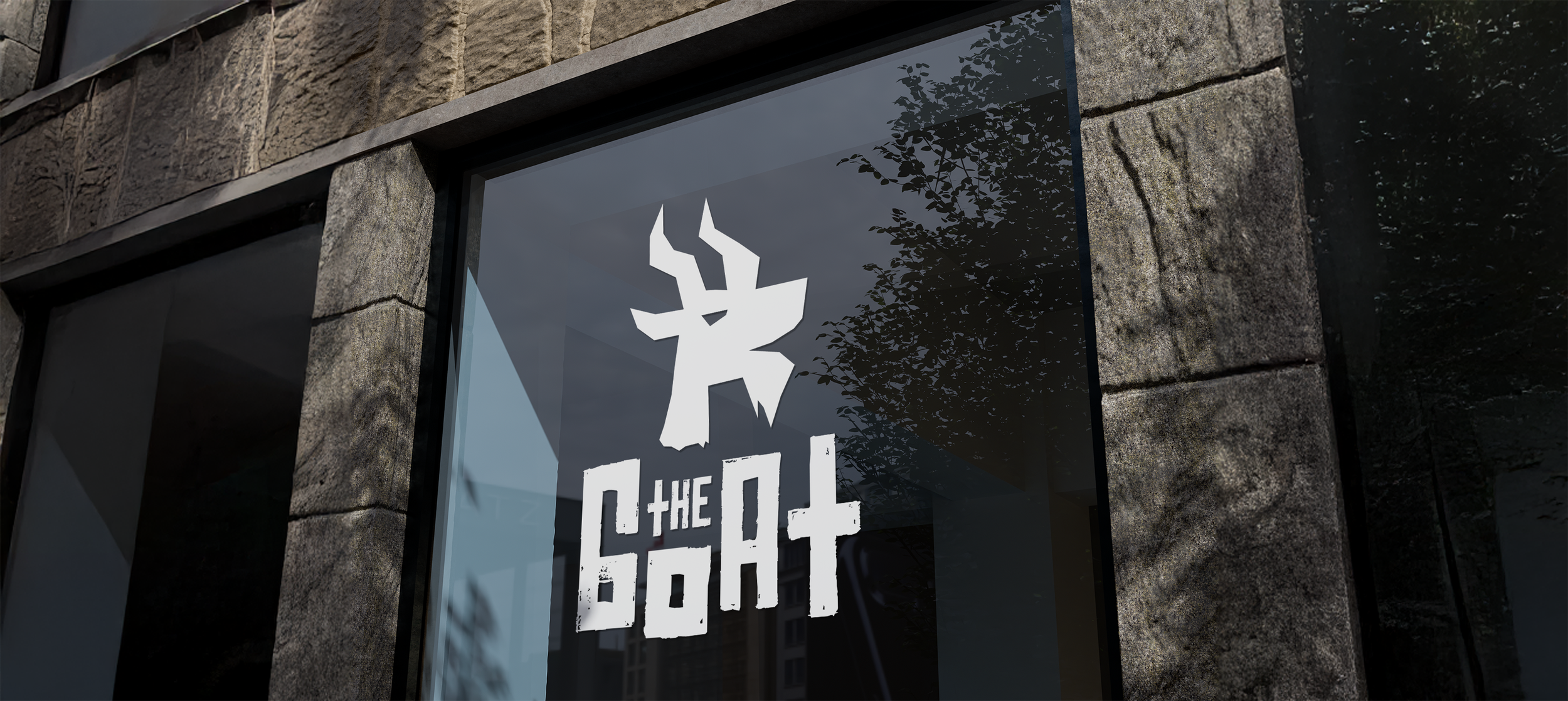
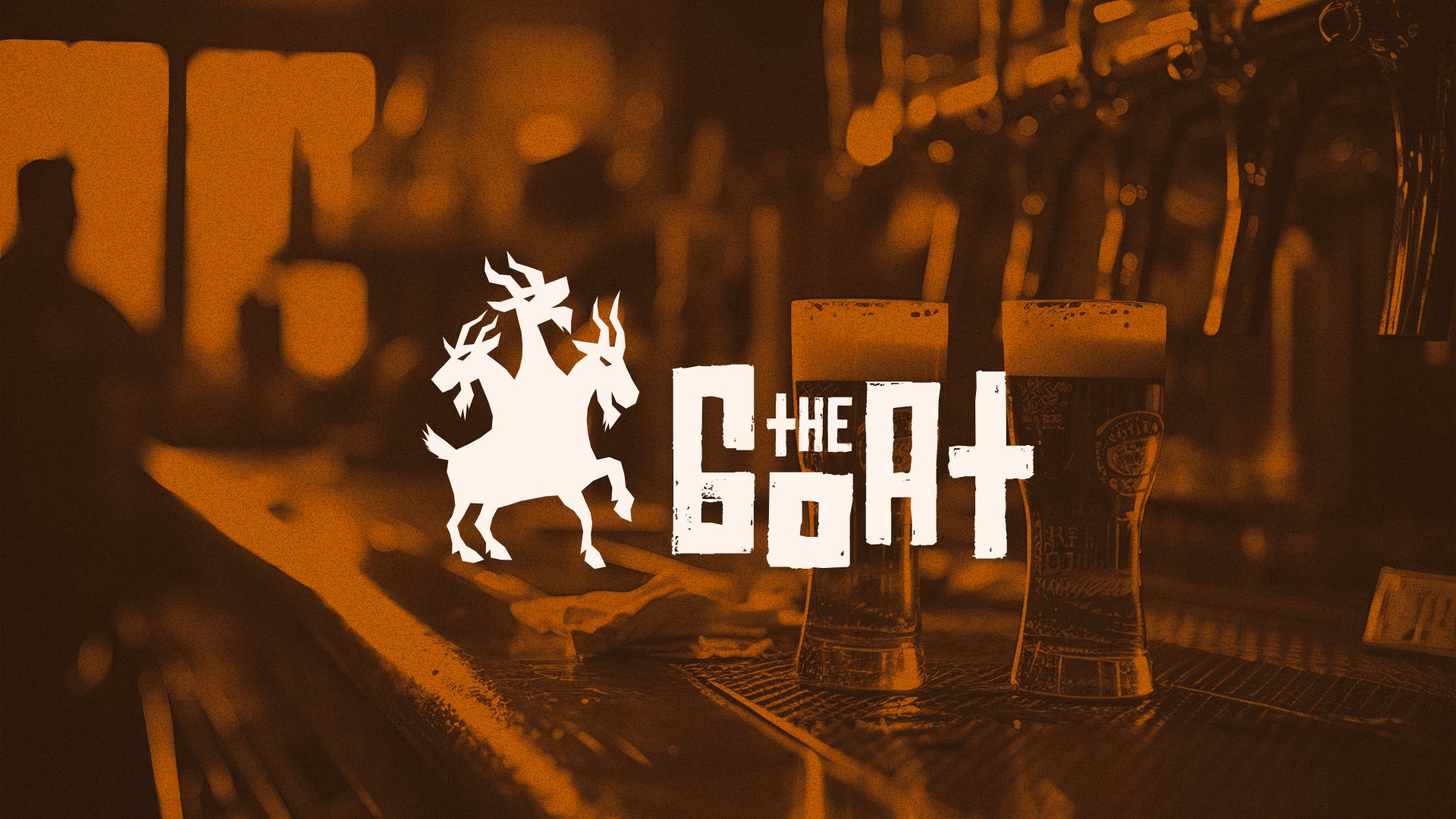
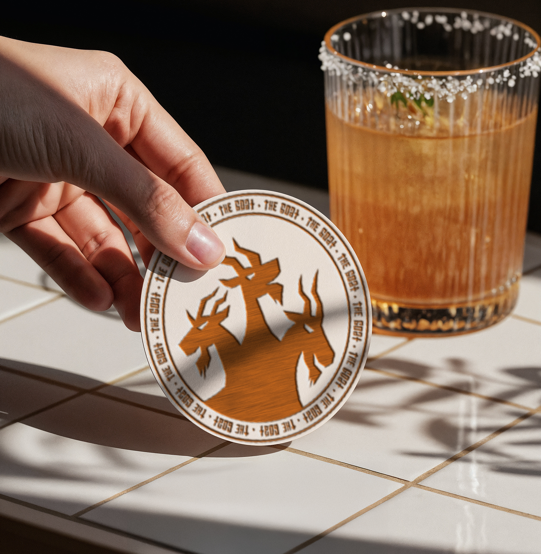
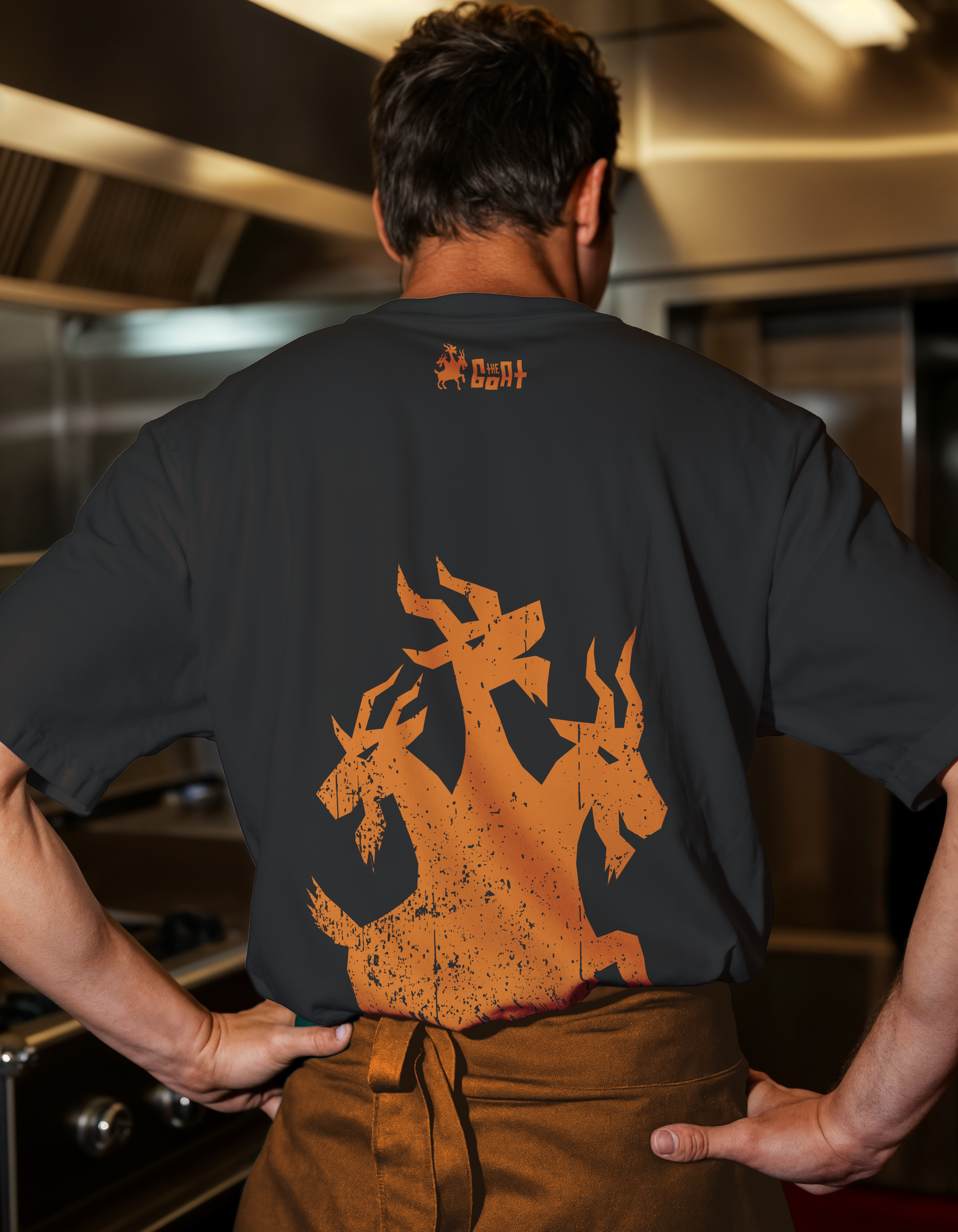
The name doesn’t need a literal story to work—what it needs is an image you can’t miss at street speed. The direction became a mythic goat figure: part familiar, part monster, with a silhouette that holds up on signage, glassware, and merch.
That choice does a few jobs at once: It gives the pub a distinctive emblem without implying a strict “theme”, It feels slightly hipster and graphic, without being trendy and it creates an icon strong enough to live on its own, even when the wordmark isn’t present.
A bold two-color palette was chosen for high contrast and instant recognition in a busy street context. A distressed, blocky wordmark that feels a little 'worn-in’ rather than newly launched creates more of a ‘local fixtures’ kind of feeling, rather than a brand new establishment.
What We Delivered
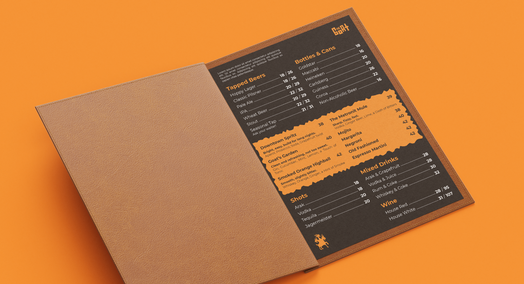
A full pub-facing kit, designed to live primarily in the space itself:
Logo + icon system
Exterior/interior signage directions
Coasters and glassware
Menus
T-shirts / merch applications
Social post templates for ongoing promotions and updates
Where it lands
The new identity makes The Goat easier to spot, easier to remember, and more aligned with what the place already is: affordable, unpretentious, fast-moving, and built around the people who fill it nightly.
It doesn’t invent a concept that wasn’t there. It simply gives the pub a stronger presence - one that feels at home in Haifa’s Downtown, and believable as something that’s been around long enough to become part of the neighborhood.