
Visual Identity for a Brand New Video Production Studio
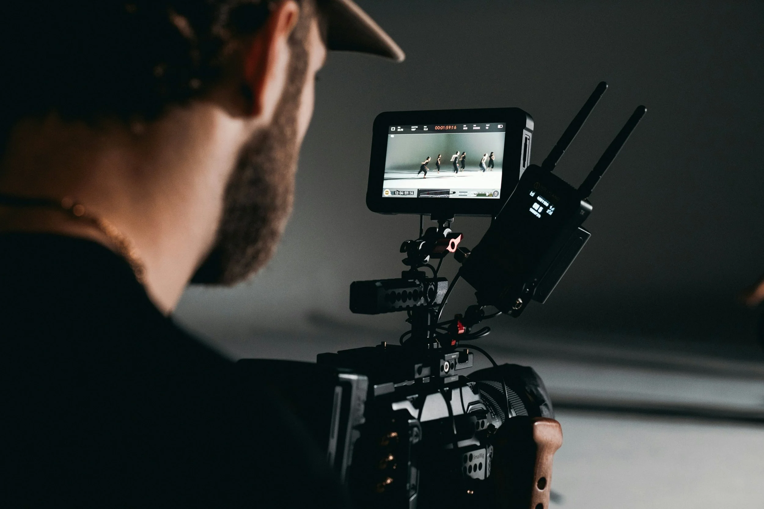
Peak Productions offers a very specific kind of video service: high-quality production for working professionals - doctors, trainers, teachers, real estate agents, who need to present their expertise clearly, without hiring a large, expensive crew.
The promise is straightforward: a smaller, more personal operation, executed with real precision.
What was missing was everything around it. No consistent visual language, no system for social or print, and nothing that could scale with the business as it moved toward retainer clients and larger projects over time.
What needed to be done
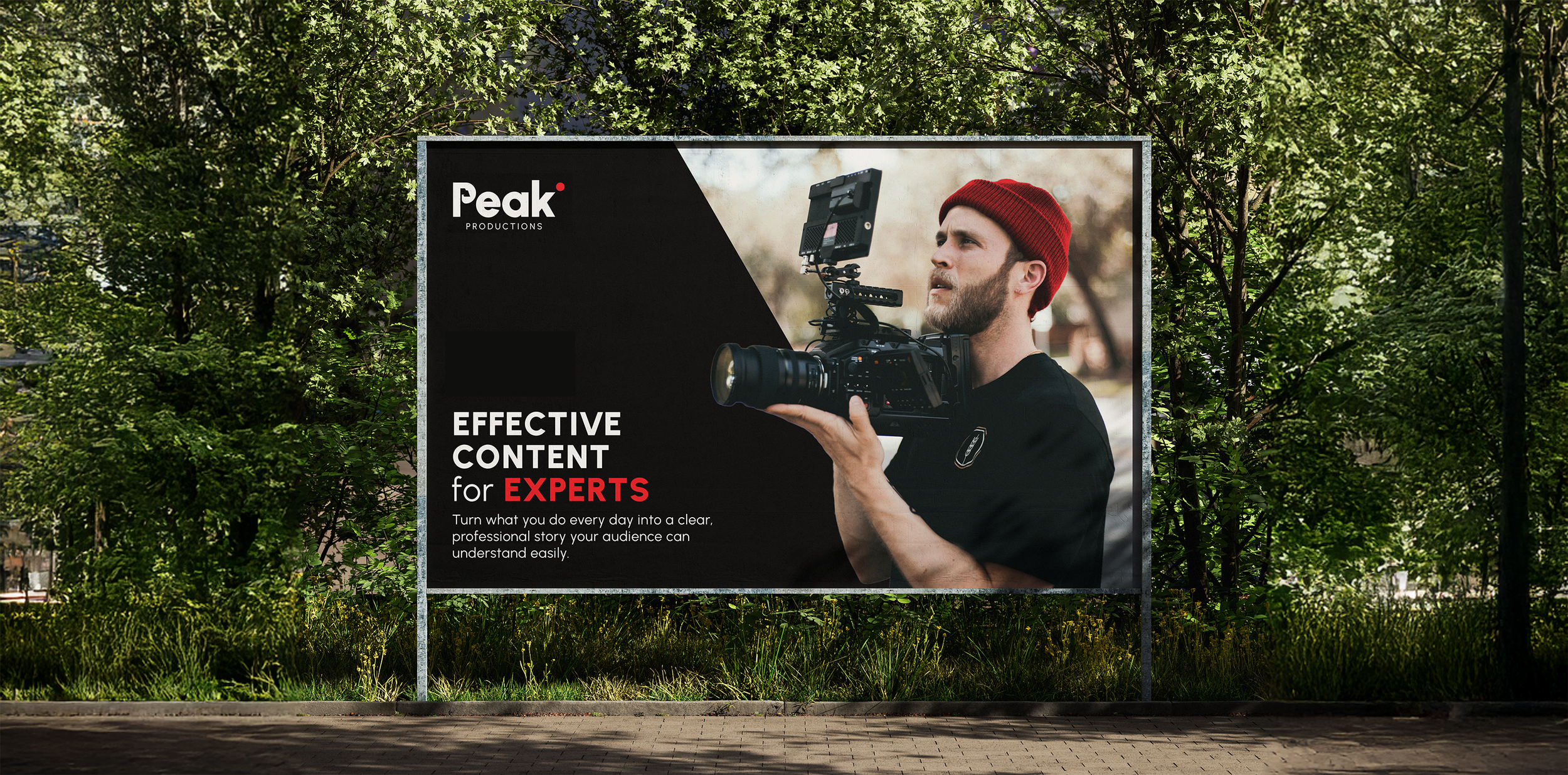
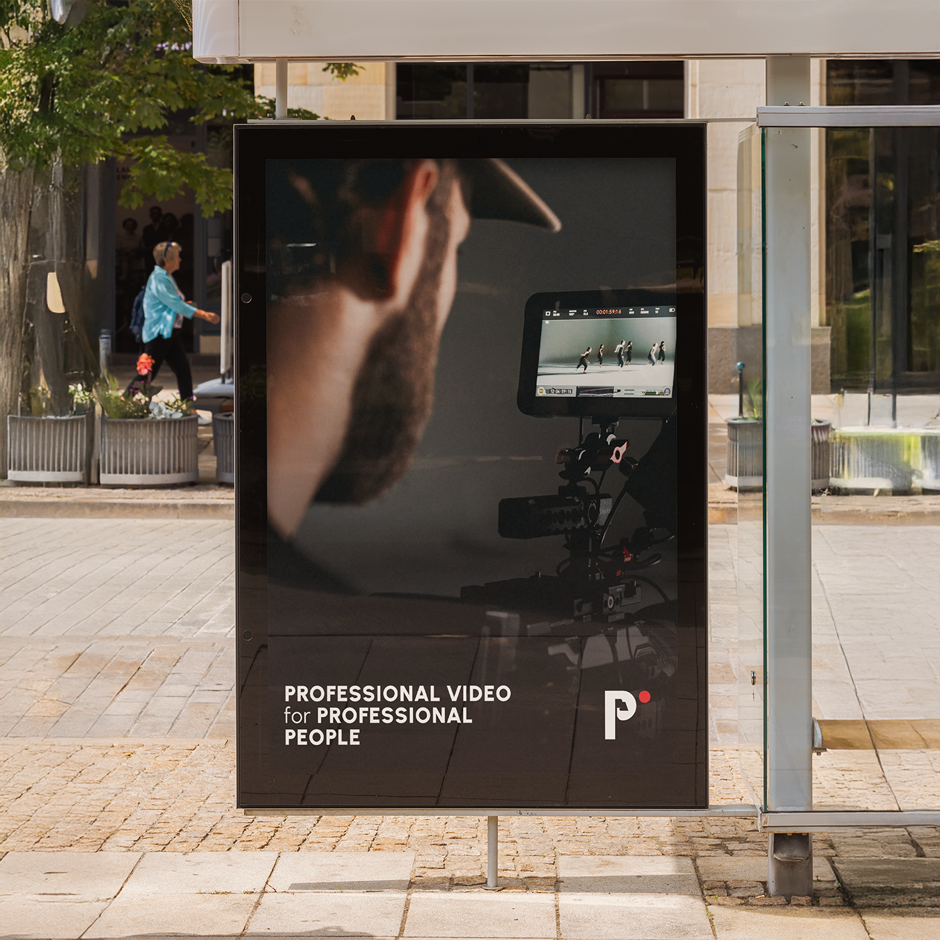
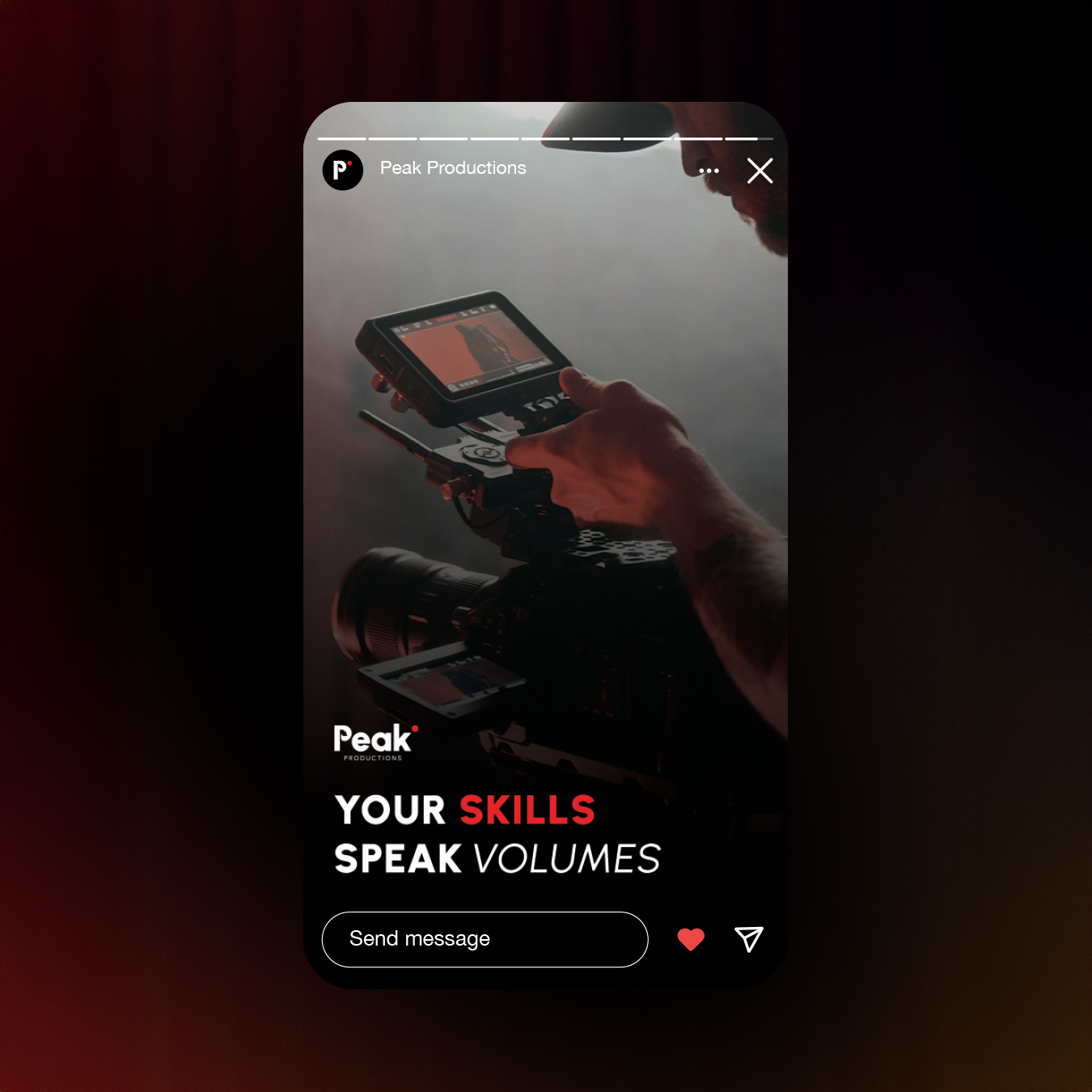
The brand had to feel professional and confident, but not cinematic or overproduced. Peak’s value is the opposite of a heavy “movie set” vibe: fast, clear, personal, and easy to work with. So the identity needed to communicate structure and trust - without noise.
Clarity, with one sharp signal
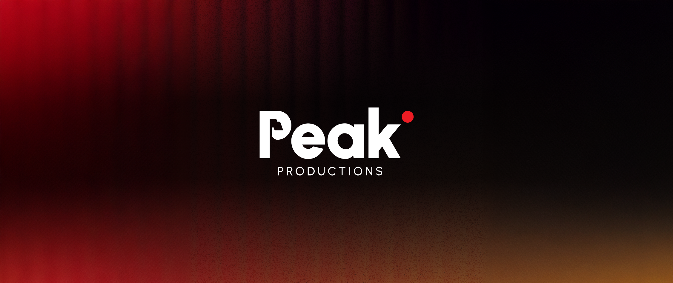
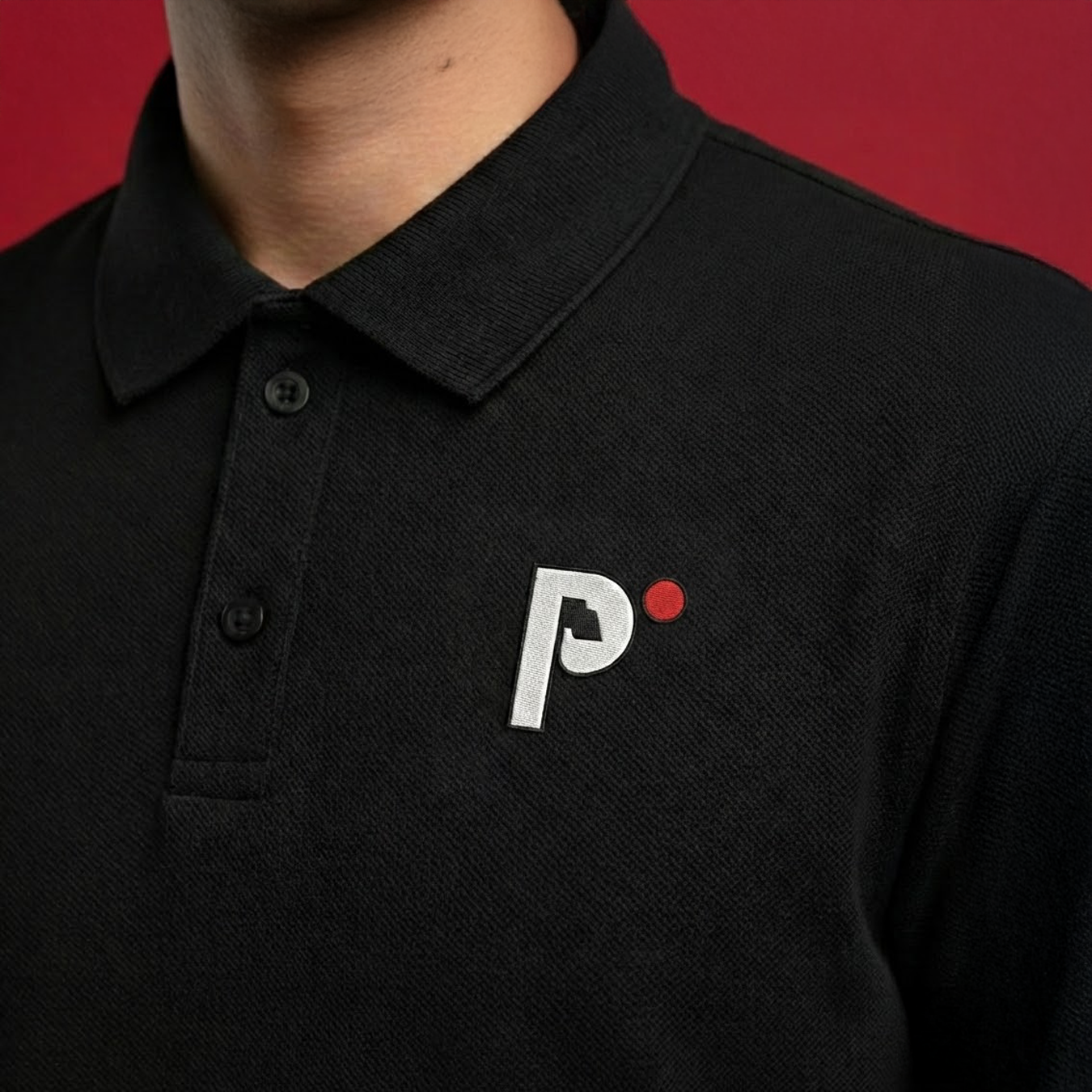
The system is intentionally minimal: black and white for order and legibility, plus a single scarlet accent pulled from the most universal symbol in video - the recording dot.
That red point becomes a functional brand device: it adds focus, creates hierarchy, and ties every application back to the moment the story starts rolling.
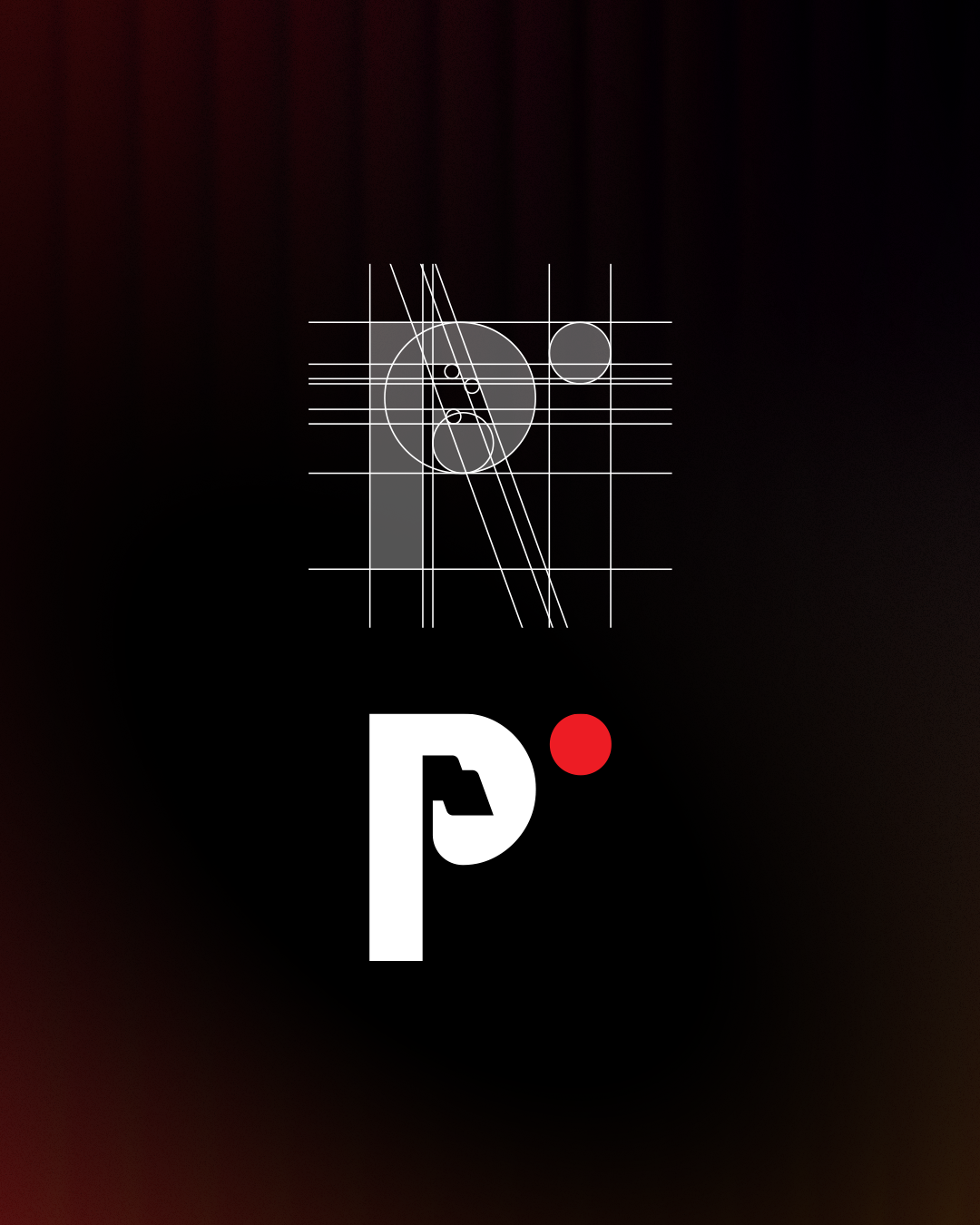
Built into the mark
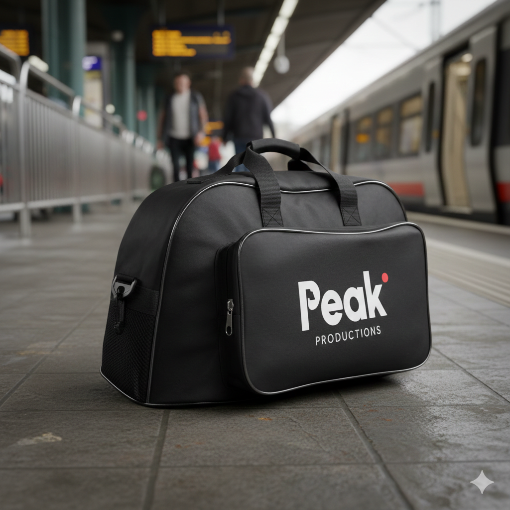
The logo is a clean, geometric wordmark designed to stay readable at any size, from social avatars to printed collateral. Inside the “P,” a small flag-like detail nods to the idea of a “peak,” adding a subtle brand metaphor without turning the logo into an illustration.
A standalone icon version (P + red dot) was developed specifically for small digital contexts - profile images, video intros, stamps, where the full lockup would be too tight.
Where it shows up
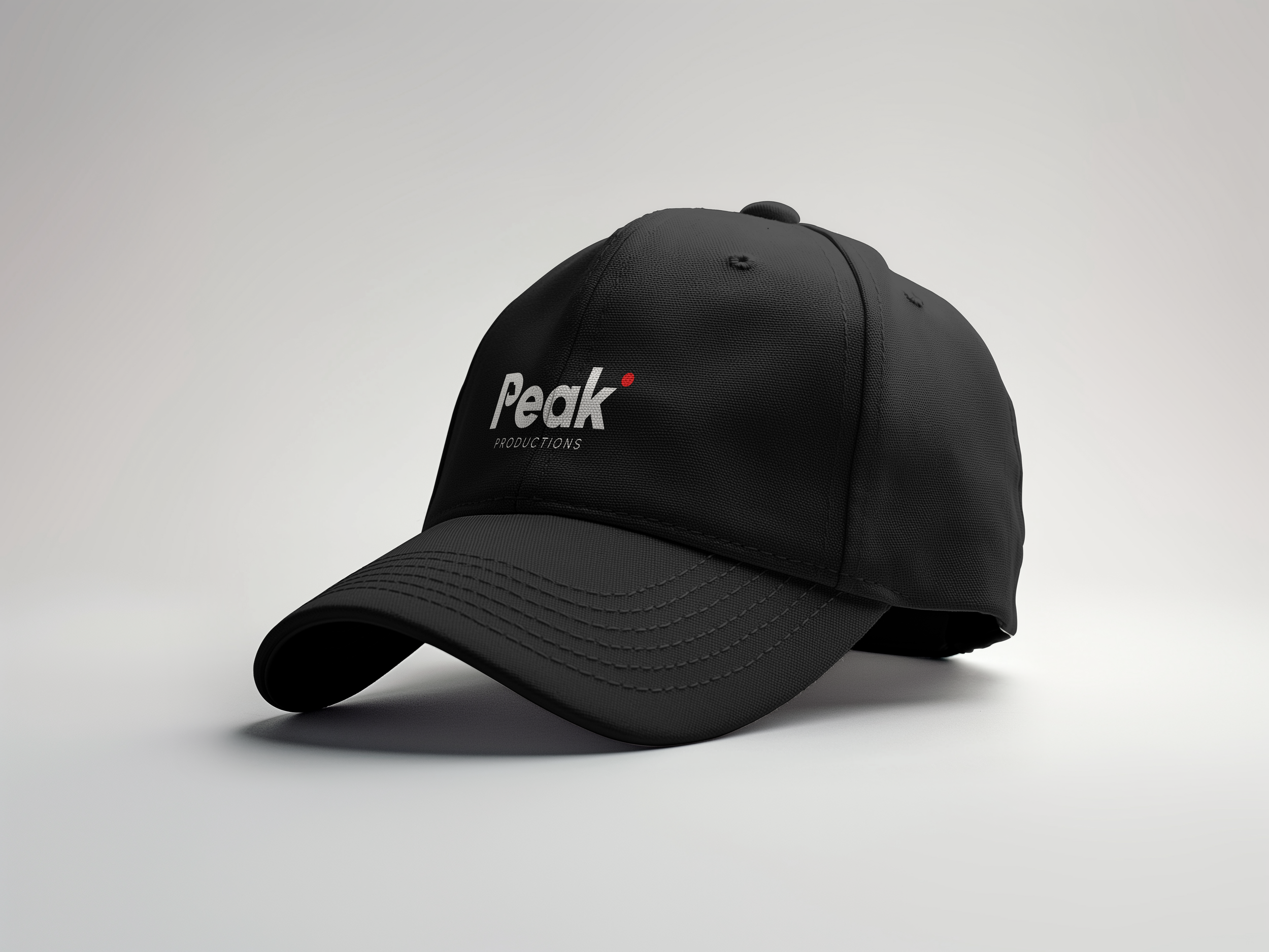
The identity was designed to live where Peak actually operates: social, street-level visibility, and physical production environments - caps, shirts, stickers, camera labels, business cards, and simple ad placements that stay legible at a glance.
Peak now has a brand that matches the service: organized, direct, and easy to trust. It doesn’t try to sell “cinema.” It sells clarity - professional video for professional people, delivered with a small-team experience that still looks the part.