Turning a Niche Program Into a Public-Facing Civil Movement
Politicaiot Tzeirot (“Young Female Politicians”) had a strong track record: years of hands-on programs, a growing alumni network, and real-world impact through graduates moving into public leadership roles. The problem wasn’t the work - it was the gap between what the organization had become and how it was perceived from the outside.
The goal of the rebrand was to close that gap by building a clearer public-facing identity: one that feels current, credible, and scalable across platforms, while still keeping the organization’s activist DNA. That meant designing a system that can live comfortably in fast-moving social content, but also hold up in more formal contexts like partnerships, programs, and events.

What Needed to Change
We needed to keep the brand young and accessible without making it feel niche or informal. At the same time, the messaging had to expand beyond “a women-only initiative” into something that signals broader civic responsibility - including an invitation for men to be part of the conversation and the change.
In practice, that meant avoiding familiar visual shortcuts: political clichés, overly “institutional” cues, or gender-coded design choices that would narrow the audience.
How We Framed It
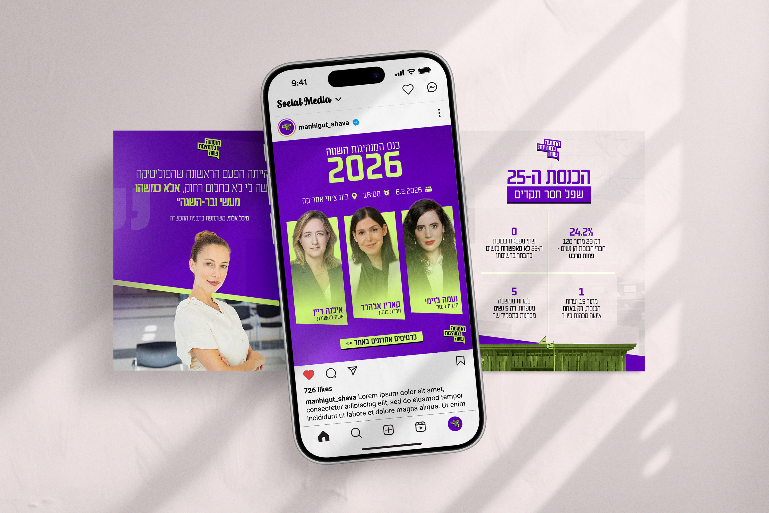
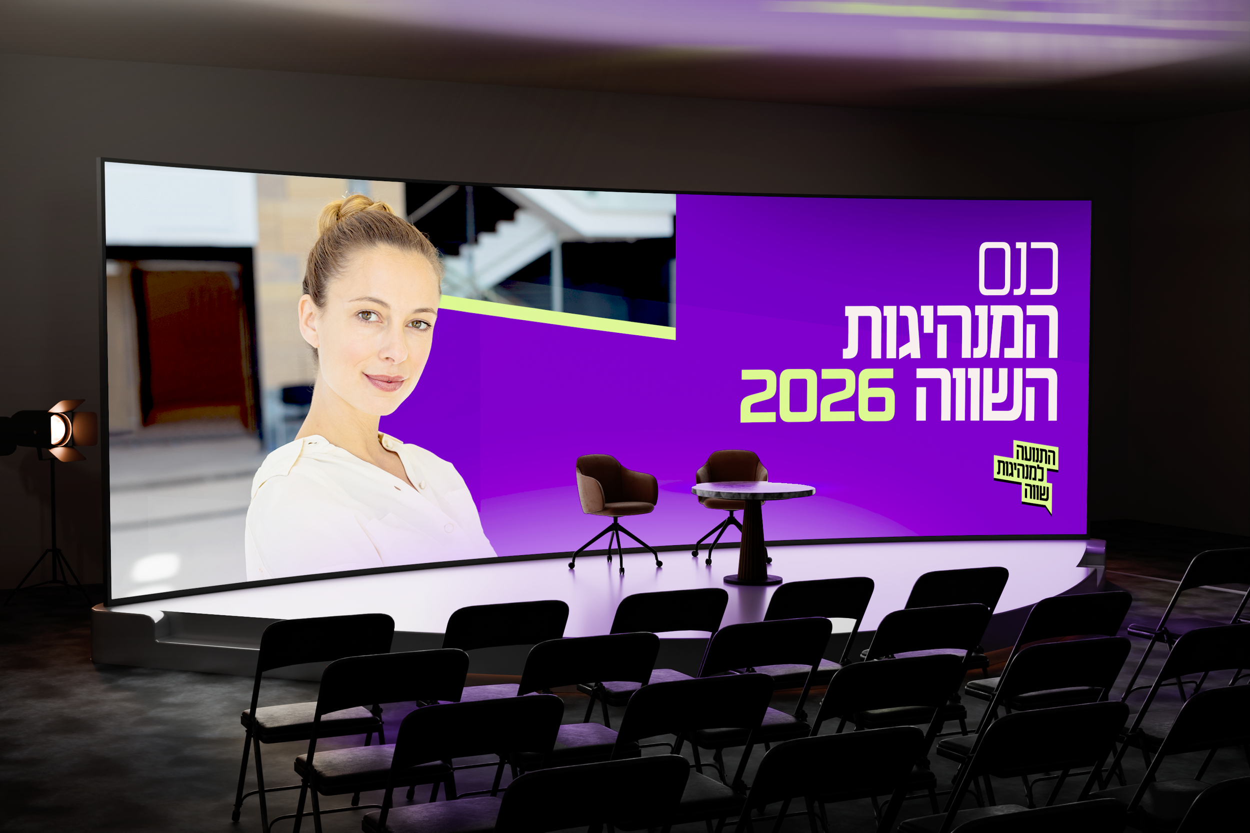
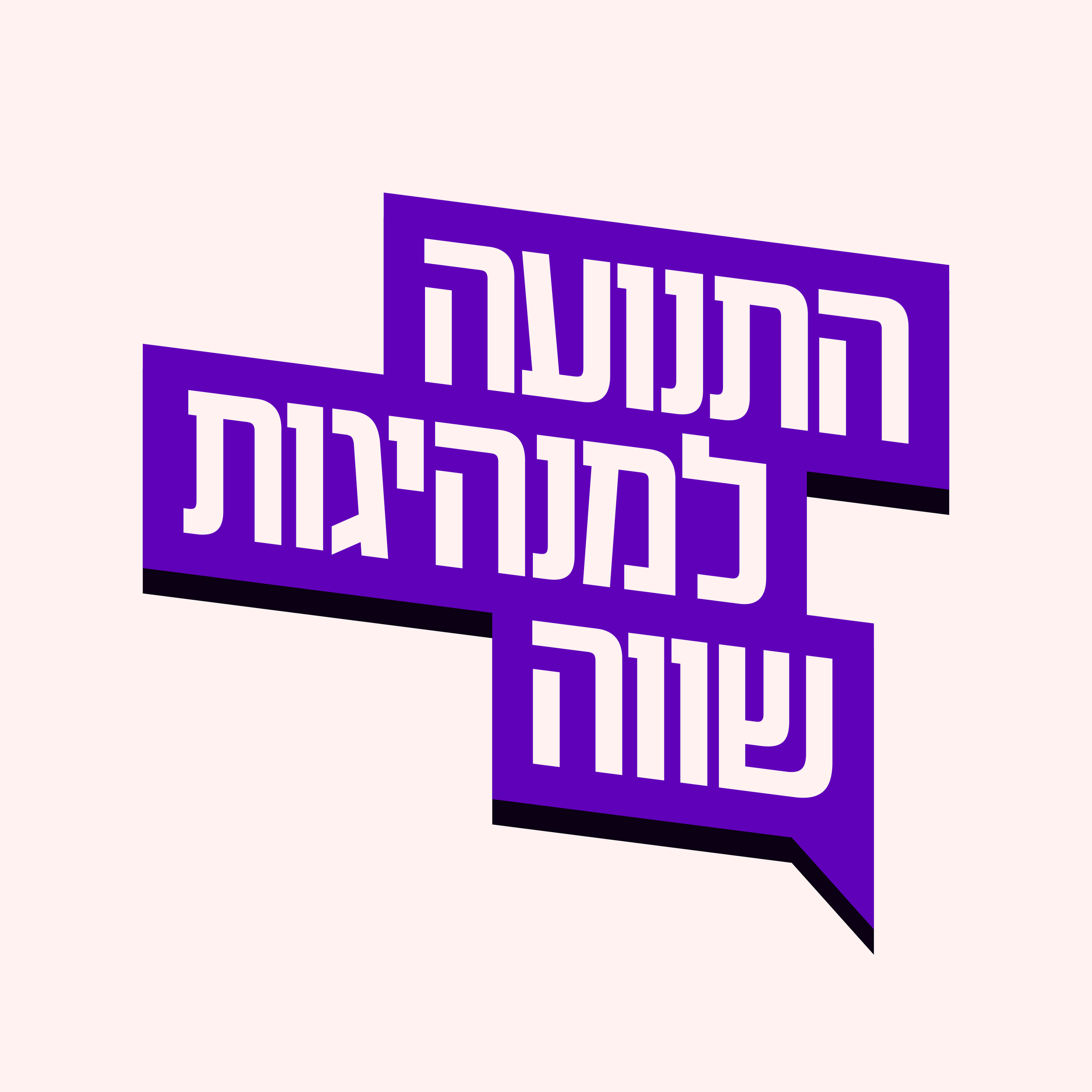
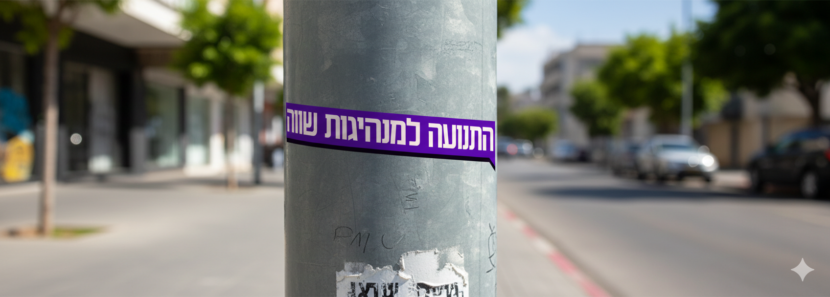
The identity was built around a simple direction: clarity first. The logo system is typography-led and structured like a statement - readable, direct, and designed to work at small sizes where most people actually encounter the brand (social headers, story frames, thumbnails, mobile screens).
From there, the visual language uses modular shapes and a speech-bubble motif to suggest conversation and participation, but in a controlled way that still feels professional. The system is flexible enough to handle different topics and content formats without losing consistency.
What Was Delivered
A primary logo and supporting marks built for digital-first use
A color system designed to be bold and modern without relying on political or gender clichés
A typography system optimized for Hebrew/English readability across social and longer-form communications
A set of social templates and layout rules to keep content consistent even when produced quickly
The Impact
The result is a brand that feels more aligned with the organization’s real scale: clear, contemporary, and capable of growing with them. Instead of being “a nicer look,” it provides a coherent system for communication - one that helps the organization show up consistently across content, programs, collaborations, and future expansion.